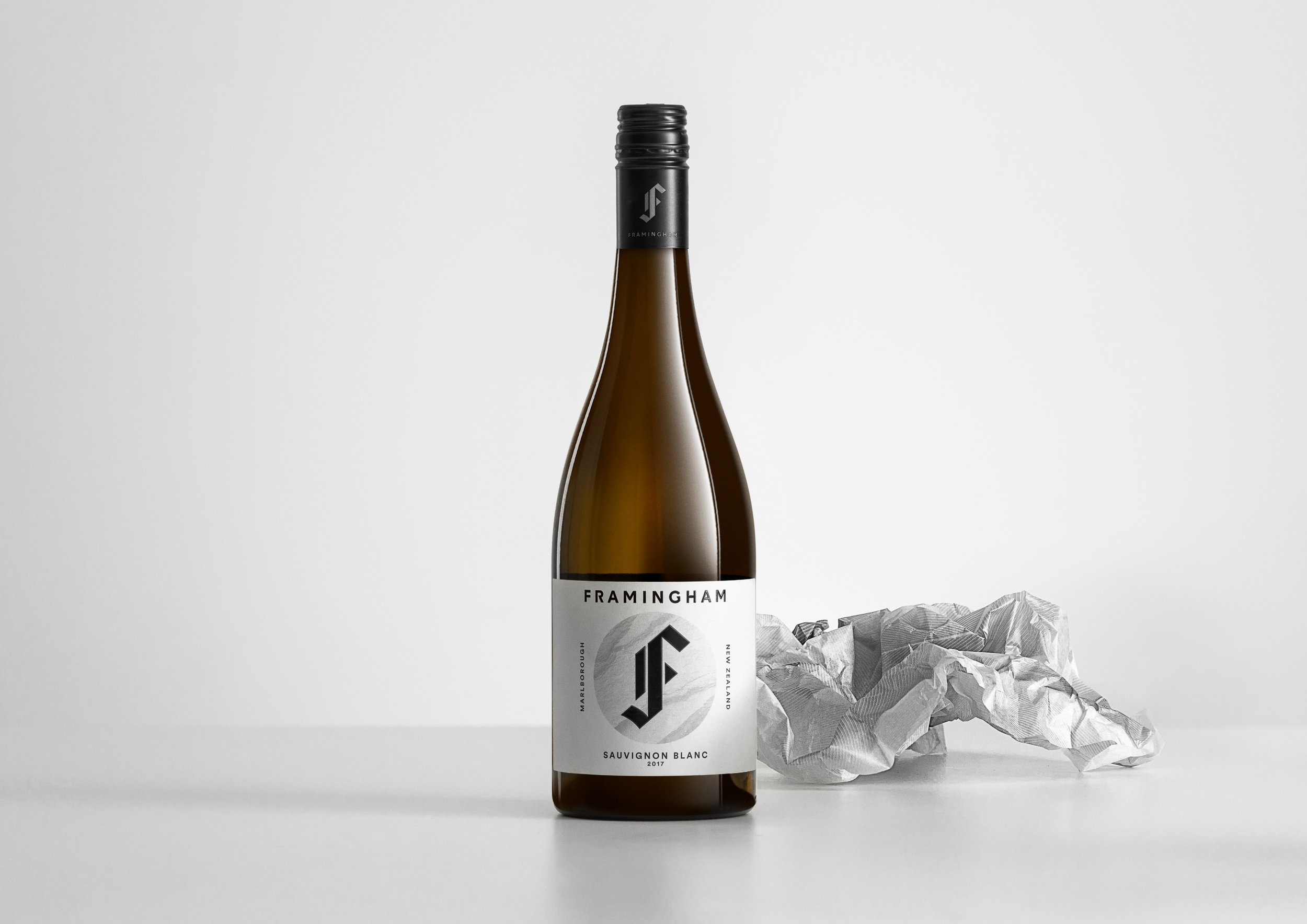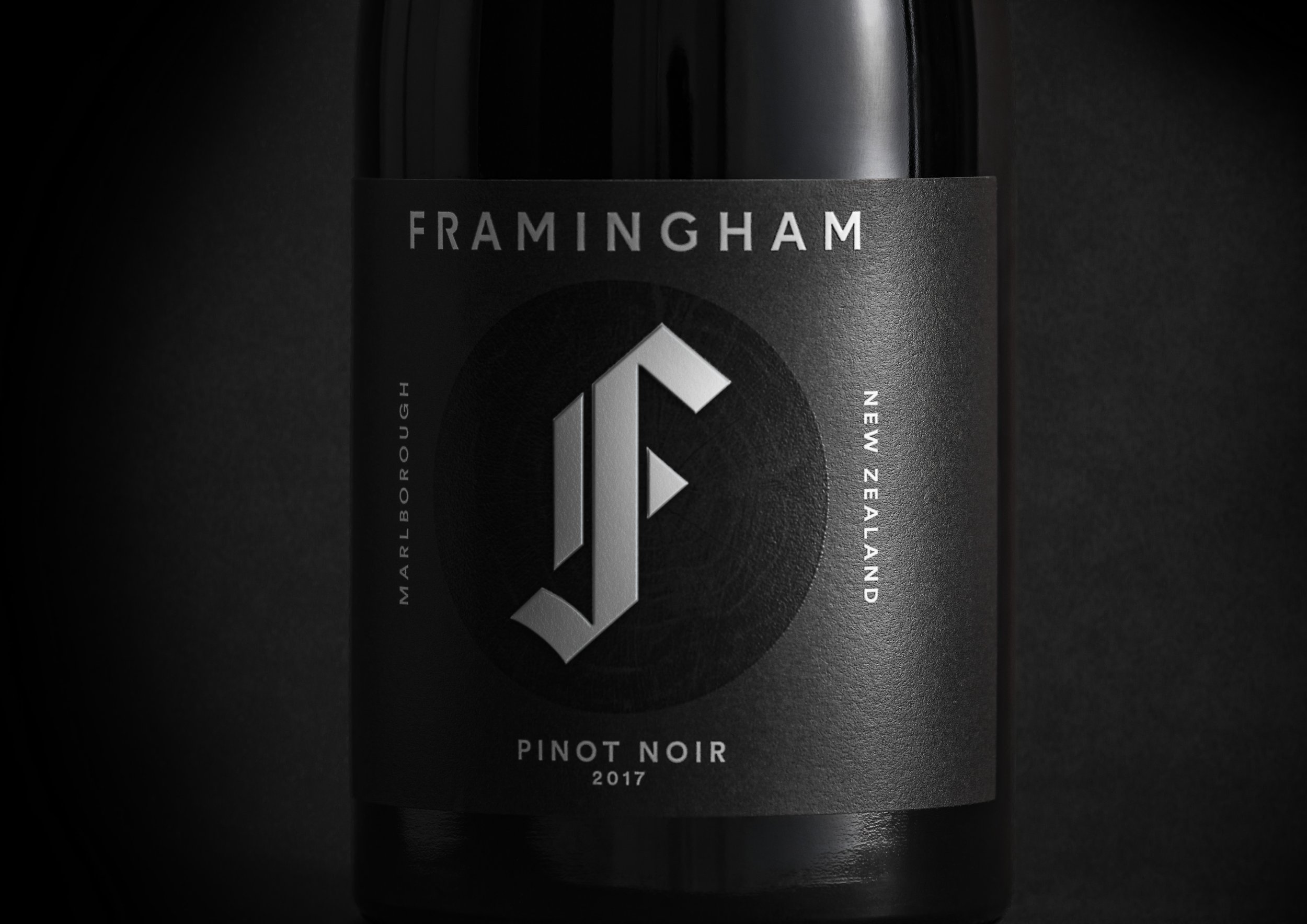
Framingham is a small yet highly regarded vineyard known for delivering quality sustainable and organic wines. They pride themselves on being bold and original, combining knowledge and innovation to create wines that traditional Marlborough vineyards wouldn’t dare.
Our brief was to update the brand and the iconic ‘F’ symbol, capturing the character of the winery with packaging that differentiated Framingham from the pack.
First we met with people at the winery to find out what makes them tick – from the charming woman at the cellar door, to the romantic viticulturist distraught at impending rain, and the winemaker with a passion for punk and rock & roll. Once we had a good understanding of their passion and commitment, we began to form a clearer impression of the winery’s character as a whole.
Framingham
A new character for wine
Strategy
Brand
Packaging
Communications