Sometimes, simplicity can be deceptively complicated, can’t it?
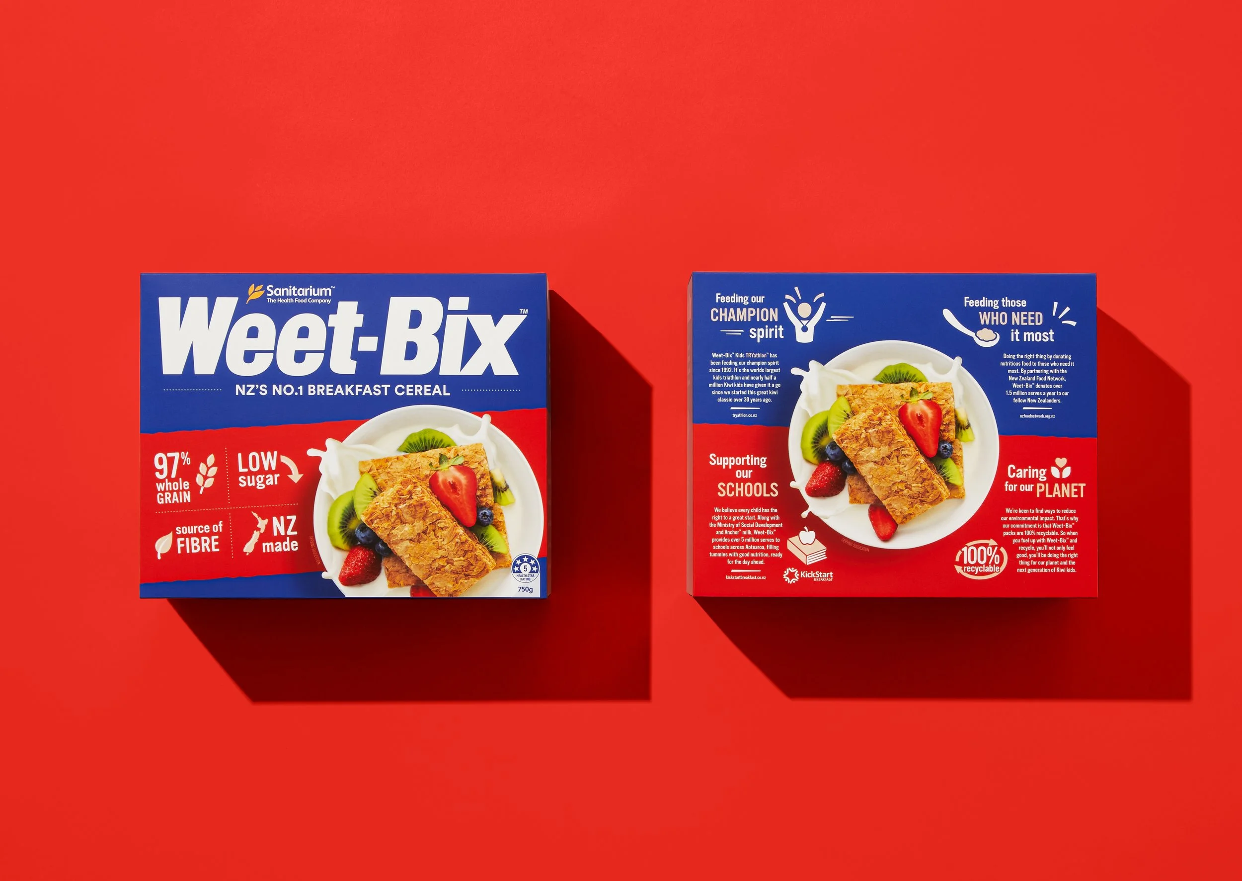
Take our work for Australasian iconic breakfast institution, Weet-Bix for example. A 100 year legacy of nourishing 2 nations had led to a broad product range with multiple packaging derivations in need of a healthy spoonful rationalisation.
We were asked to break down the brand and packaging architecture to create a more cohesive range of products while maintaining critical cues, personality and category differentiation. In essence, to simplify.
Reuniting the product with its original proposition of “simple energy”, our process of applied rationalisation was strategic at every level. A refined design system was fed by 2 years of consumer research and a deep dive into proprietary assets and established neuro-triggers. It’s science and art on the same plate.
Remember, this is one of Australasias best known brands - so the resolved pack architecture is evolutionary, not revolutionary (if you’re that number 1 product in category, you’re already doing something very right), but it is remarkable in the integration and systemisation it brings across the entire Weet-Bix portfolio.
Weet-Bix
Simple is good
Architecture
Brand
Packaging


